Monday, 21 February 2011

Analysis of Double Page Spreads

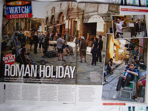
This double page feature for Doctor Who has various attention grabbing conventions. A large picture along with text deliberately made large and bold to get the reader to read on. The Doctor Who logo is used also to get the point across to the reader as to what the feature is about. There are words with red backgrounds highlighting important items on the page like 'exclusive' and 'on set in Rome'. There's large, bold text with a slightly destroyed look to it that reflects the sci-fi genre.


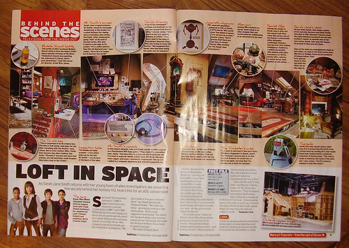
This one is another behind the scenes feature of The Sarah Jane Adventures. This again highlights certain things with large, bold lettering over a red backdrop. There are large pictures also with various, small pieces of text explaining and elaborating on them. Again, there's large, bold text in capitals, and pictures with loads of space-age looking gadgets in them reflecting the sci-fi genre.


This is another sci-fi Doctor Who feature. There is a lot less text on this feature, and it consists mainly of images of various characters from Doctor Who. Again, there are a lot of conventions here reflecting the science fiction genre. The lack of text may suggest a lower class demographic.
Saturday, 19 February 2011

Details of Advert Placement

My poster advertisement for our drama should be in The Times newspaper. This newspaper as a younger age target audience which is similar to the target audience of our radio drama. Our audience would be more middle class which links in more with that of The Times. I think The Times would be the best place for my advertisement as that's where we would find the audience that fits our target audience.

Friday, 18 February 2011

Rest of Group Posters

This is Joe Frost's poster for our drama Under the Mushroom Cloud:
This is Lucie Glennon's poster:

Wednesday, 16 February 2011

Poster: Final Version

This is my final poster design:

 Like with other advertisements for dramas, I tried to make sure that the poster reflected the mood and genre of the radio drama. Because it's a science fiction, post-apocalyptic narrative, I tried to maintain this mood with various conventions. I used a grungy, grey wall with blood-red graffiti text to keep the feel of our drama. I also included the logo of the station it would be broadcast on, BBC Radio 4 Extra, but I changed the logo from being purple to the same red as the text. BBC Radio 4 Extra used to be BBC Radio 7, which was a radio station that broadcast loads of radio dramas. The re-branding was done to provide more comedy and drama and to include more family friendly content for older children.

Monday, 14 February 2011

Poster Development

To achieve the desired feel to reflect the theme of our radio drama, I had to go through several steps to make it look right. The first thing I did was edit a picture of a wall using Adobe Photoshop to make it look more grey and reflect the mood of the drama.
I did this by desaturating the image to take out a lot of colour and by using the Levels Tool in Photoshop:
On this wall I wanted to have the name of the drama, Under the Mushroom Cloud, spray painted like graffiti. To do this, first I used Photoshop's Pen Tool to draw graffiti-looking words spelling the name of our drama.
Then, I skewed the words to the correct perspective of the wall:
Then, I changed the colour to red, blended it into the wall and added some drip marks to make it look more authentic, then repeated this for the other words on the poster.

Sunday, 13 February 2011

Poster Design: Rough Design

A poster for any media product should reflect the tone and genre of what it's advertising. That's why for my poster I want it to reflect the dark, post-apocalyptic nature of our radio drama.

For my poster I want to have the name of the drama, 'Under the Mushroom Cloud', to be sprayed in red paint onto a cracked, dilapidated wall. In the background behind some iron railings there would be a faded mushroom cloud in the sky.

Saturday, 12 February 2011

Analysis of Posters

This advertisement for The Hitchhiker's Guide to the Galaxy reflects heavily on the genre and theme. We can clearly see the night's sky in the background with lots of stars. This reflects the sci-fi genre of Hitchhiker's Guide. The typeface is used again to reflect the genre. Large, bold, capital letters have action/science fiction connotations.


This is an advertisement for another science fiction drama, The War of the Worlds. Large, bold letters are again used on top of a picture of an alien vessel firing a laser, reflecting the theme and genre of the piece.


The Archers, being a completely genre to War of the Worlds and Hitchhiker's Guide, looks completely different. It is calmer more chilled out with small, white text displaying the name, along with the bright image of a field in the background. These things reflect the theme and genre of The Archers.